

Designing For Print: Tips And Tricks For Creating Stunning Printed Materials
Have you ever created a design that looked great on your computer screen, but disappointing when printed? Designing for print requires a different set of skills than designing for digital media. From choosing the right colors to selecting the appropriate paper stock, there are several factors to consider.
Printed materials, such as brochures, flyers, and business cards, can be powerful marketing tools. They can help you promote your brand, showcase your products and services, and reach out to new customers. However, a poorly designed print material can also harm your brand’s reputation and credibility.
If you want to create stunning printed materials, you need to understand the principles of print design. In this article, we will share some tips and tricks that will help you design for print like a pro. Whether you are a graphic designer or a business owner, these guidelines will help you create visually appealing and effective printed materials that will impress your audience.
Understanding The Basics
Understanding the basics of designing for print is crucial to achieving stunning results for your printed materials. From choosing the right paper type to considering color schemes and printing methods, every little detail can affect the overall quality of the finished product. Whether you’re designing business cards in Los Angeles, flyers, brochures, or custom products, it’s important to have a solid foundation of knowledge to create designs that not only look beautiful but also convey your message effectively. In this article, we’ll provide tips and tricks on designing for print that will help you create visually appealing and high-quality printed materials.
DPI Vs PPI
Designing for print requires an understanding of various technical terms and concepts, including two commonly used terms: DPI and PPI. DPI stands for “dots per inch,” while PPI stands for “pixels per inch.” It is essential to understand these concepts because they can significantly impact the quality of your final printed product.
When designing a print project, it is crucial to ensure that the PPI of your design aligns with the DPI used by your printing company. The printing company will use a specific DPI setting to print the design, which is typically 300 DPI for high-quality prints. If the PPI is too low, the final print may appear blurry or pixelated, resulting in a low-quality finished product.
For example, suppose you design a business card with a PPI of 72 and submit it to a printing company with a DPI of 300. In that case, the printed business card may appear blurry and have jagged edges since the design’s resolution is insufficient to produce high-quality printed output.
Moreover, it is essential to use CMYK color space instead of RGB as the printing process uses the CMYK color model. RGB color mode is ideal for digital display, and it may appear differently when printed. Therefore, it is vital to make sure that the design’s color spaces and range of colors align with the printing company’s printing methods to achieve the desired output.
Incorporating high-quality images and vector images can also enhance the finished product, as they maintain their quality even when resized. Additionally, file formats and file size are critical factors because large file sizes can make the printing process slow and increase printing costs.
Color Spaces – RGB Vs CMYK
When it comes to color, the RGB and CMYK color modes are two widely used color spaces. The RGB color mode is an additive color system, primarily used for digital displays such as computer screens, televisions, or projectors. The CMYK color mode, on the other hand, is a subtractive color system used for printing purposes.
The RGB color mode uses red, green, and blue to produce a wide range of colors. With RGB, these three primary colors are combined to create secondary and tertiary colors, resulting in a broad and vivid color palette that can accurately depict nearly all colors in the light spectrum. It allows for precise control over the brightness of each primary color, enabling designers to produce vibrant and bright hues. However, the RGB color space has limitations in accurately representing certain colors that are present in the printing process.
On the other hand, the CMYK color mode relies on four ink colors: cyan, magenta, yellow, and black. These four colors are used in varying proportions to create different hues that give a complete color spectrum. CMYK is the industry standard for printing, and it offers precise control over the color outcome. The printing process reflects light differently than digital displays by absorbing light instead of emitting it, which is why subtractive colors are used to produce accurate and realistic printed output.
When it comes to deciding which color space to use, it ultimately depends on the purpose of the design. The RGB color space is more suitable for digital displays and screen-based media, whereas CMYK is more applicable in the printing process. When designing for print, it is essential to use CMYK color mode as RGB colors may not be accurately translated to the printed work resulting in different color hues, which is why CMYK is the preferred color space for printed products such as brochures, flyers, business cards, and other printed materials.
Range Of Colors Available For Printing
When it comes to designing for print, it’s crucial to consider the range of colors available for printing. Most printing companies use the CMYK color mode, which offers a full color spectrum by using varying amounts of cyan, magenta, yellow, and black ink. This allows for precise control over color outcomes, resulting in printed materials with accurate color representation.
However, it’s important to note that the colors you see on your screen may not always be accurately reproduced in print due to differences in color spaces and the limitations of the printing process. This is why it’s essential to choose a color scheme that will translate well to the finished product. Designers must consider the shades, tones, and hues that are most appropriate for the print medium, taking into account any potential discrepancies between the digital image and the finished product.
When it comes to printing, there are certain limitations that designers should be aware of. Some printing methods may result in a more limited range of colors. For instance, with digital printing, there may be a lack of color representation, particularly with lower-quality images.
File Formats – Vector Images Vs High Quality Images
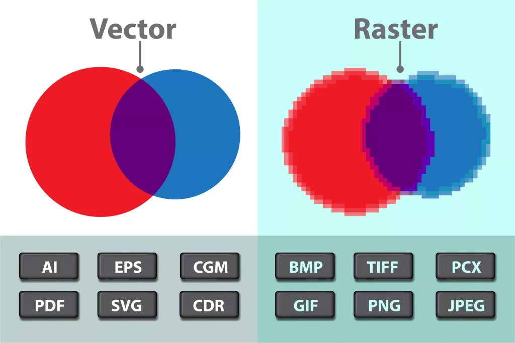
When it comes to designing for print, the Los Angeles Print Shop is best choosing the right file format is essential to ensure a high-quality finished product. Two common types of images used in design are vector images and high-quality images, also known as raster images. Understanding the differences between these two types of images is key to selecting the correct file format for your design project.
Vector images are made up of mathematical equations and geometric shapes, rather than pixels. This means that they can be scaled up or down without losing any quality or becoming pixelated. Vector images are often used for logos, icons, and other graphics that need to be resized frequently. Common file formats for vector images include .ai (Adobe Illustrator), .eps (Encapsulated PostScript), and .svg (Scalable Vector Graphics).
On the other hand, high-quality images, or raster images, are composed of pixels. When enlarged beyond their pixel count, raster images can become pixelated and lose quality. Raster images are often used for photographs and other complex images. The most common file formats for raster images include .jpg (JPEG), .png (Portable Network Graphics), .tif (Tagged Image File Format), and .gif (Graphics Interchange Format).
When choosing a file format for print, it is important to consider the specific requirements of the printing process. Some printing methods may have specific requirements for file formats and resolutions. It is always best to consult with the printing company to ensure that your file is compatible with their equipment.
For web-based designs, file size and load time become a crucial aspect. For vector graphics, file formats like SVG and PDF are ideal as they are lightweight and can be scaled without losing quality. For high-quality images, .jpg and .png formats are most commonly used for web-based designs.
It is important to note that some programs, such as Adobe Photoshop, can save vector graphics as raster images, depending on the settings used when exporting the file. Therefore, it is important to check the settings and double-check the file type selected before exporting.
In recent years, SVG has become a popular file format for web-based designs. SVG is a versatile vector format that is ideal for creating graphics that can be scaled to any size without loss of quality. SVG files are also lightweight, making them ideal for web-based designs. As a result, many designers are shifting towards SVG for web-based designs.
File Size And Pixels Per Inch (PPI)
When creating printed materials, file size and pixels per inch (PPI) are crucial factors that affect the quality of the finished product.
File size refers to the amount of space a digital file takes up on a device or storage medium, and it can impact the quality of a printed material. A file that is too small may become pixelated or blurry when enlarged to fit a larger print size. In contrast, a file that is too large may slow down the printing process or even cause errors.
PPI, on the other hand, refers to the number of pixels present per inch in an image or graphic. A higher PPI means that there are more pixels per inch, resulting in a higher image resolution and better image quality. For example, an image with 300 PPI will look sharper and more detailed than an image with only 72 PPI.
To determine the appropriate PPI for a printed material, it is important to consider the printing company’s DPI. DPI stands for dots per inch, which measures the number of dots of ink per inch that a printer can produce. The optimal PPI for a printed material may vary depending on the printing company’s DPI, which can range from 240 to 1200 DPI. A general rule of thumb is to ensure that the PPI is at least double the printer’s DPI to achieve the best print quality.
There are various file formats suitable for printing, each with its own advantages. For instance, PDF files are widely used for print materials because they can retain high-quality images and graphics and are compatible with most printers. TIFF files also offer a high level of detail and image quality, and they are commonly used for larger prints, while JPEG files are suitable for smaller prints and digital use.
Vector files are also an excellent option for printing as they can be scaled up or down without losing resolution or becoming pixelated. This is because vector files are composed of mathematical equations and geometric shapes, rather than pixels. Vector files are typically saved in formats like .ai or .eps and are excellent for logos, graphics, and other artwork that requires resizing for different print sizes.
When creating files for print, it is essential to optimize file sizes while maintaining high print quality. Optimizing file sizes can help ensure that files are not too large and do not affect the printing process. Techniques like compressing images and using appropriate file formats can help create smaller files without sacrificing print quality.
Creating The Design Process
Creating stunning printed materials requires a well-planned design process that takes into account various factors such as file sizes, PPI, and file formats. A successful design process also involves understanding printing methods and techniques, as well as the types of paper and colors available. With the right approach, designers can produce high-quality prints that are visually appealing and effective in conveying the intended message. In this article, we’ll discuss tips and tricks for creating stunning printed materials through a comprehensive design process.
Choosing The Right Software – Adobe Photoshop, Illustrator, Etc.
Choosing the right software is vital for creating stunning printed materials. Among the popular software options used for designing print materials, Adobe Photoshop, Illustrator, and InDesign stand out. Each of these applications has its strengths and weaknesses, and understanding these differences can help you choose the right software for your print project.
Adobe Photoshop is an excellent choice for projects that require photo manipulation and editing. It offers a wide range of photo editing tools and allows you to create high-quality images. However, Photoshop is primarily geared towards raster graphics, which are not suitable for large format prints.
On the other hand, Illustrator is often considered the best option for creating large format prints because it enables you to create vector images, which are resolution-independent, meaning that they can be scaled up or down without losing quality. Hence, Illustrator is a great choice for creating logos, graphics, or text-based designs.
InDesign, the newest of the three software options, is designed for creating long documents such as magazines, booklets, and catalogs. It offers more advanced layout and typesetting tools, and you can seamlessly incorporate Photoshop and Illustrator designs and images into your InDesign project.
When choosing software for your print project, you should consider factors such as the type of print project, the desired image quality, and the output size. Whichever software you select, you should set up your files correctly by selecting CMYK color mode, accounting for bleed and trim, and ensuring that the resolution is at least 300 DPI.
Utilizing Design Elements To Create A Professional Look
When it comes to designing for print, it’s not just about selecting a suitable software and ensuring proper file setup. Another crucial aspect is utilizing design elements to create a cohesive and professional appearance for your printed materials.
Design elements refer to the basic components of any design, such as line, shape, form, texture, color, and space. These elements can be used to create a visual hierarchy that directs the viewer’s eye to the most important information and helps communicate the intended message effectively.
One of the essential aspects of creating a professional look for your printed materials is to limit your color palette. By sticking to a limited range of colors, you can create a cohesive and unified look that appears polished and professional. For instance, if you’re designing a business card for a law firm, you may want to choose muted, refined colors rather than bright, bold hues.
In addition to utilizing a limited color palette, consistent typography is also essential in creating a professional look. Choosing appropriate fonts and maintaining consistency throughout your design can convey a sense of expertise and credibility. Moreover, avoid using too many fonts or inconsistent font sizes, as this can make your design appear unprofessional and cluttered.
An effective use of negative space is another way to create a clean and professional appearance for your printed materials. Negative space refers to the area around the main design elements, and balancing it with the design components can help create a visually pleasing composition. By giving breathing space to your design, you can allow the viewers to focus on the essential elements of your design, thereby delivering the intended message more effectively.
Incorporating design elements like line, shape, form, texture, color, and space can create a cohesive and professional look for your printed materials. By utilizing a limited color palette, consistent typography, and negative space effectively, you can create a visually pleasing design that conveys your message adequately. Remember, a professional-looking design can make a significant difference in the overall impression of your printed materials.
Selecting Appropriate Paper Type And Finishing Options For The Project
Selecting appropriate paper type and finishing options is a critical step in ensuring a high-quality finished product for your print design project. Factors such as the purpose of the material, design elements, and the printing method will help you determine the ideal paper type and finishing options.
When considering paper type, it is essential to think about the purpose of the material. For instance, if you’re designing a business card, a card stock with a thickness of 16pt or 24pt may be more suitable than a thinner one. On the other hand, glossy paper may be ideal for printed photographs as it brings out the vivid colors and enhances the sharpness of the image. Similarly, paper with a textured finish can add a tactile quality to your design, imparting a sense of luxury and elegance.
Additionally, the printing method used for your project can also influence your choice of paper type. For instance, if you’re using digital printing, uncoated paper may be a better option, while offset printing may work well with coated paper.
In addition to the paper type, finishing options can also enhance the look and durability of your printed materials. Laminating your material provides an extra layer of protection, which helps prevent creases and stains, making your design more durable and long-lasting. Embossing or debossing also adds texture and depth to your design, making it visually interesting and more impactful.
Incorporating Bright Colors And Color Options To Make Your Design Pop
Incorporating bright colors and color options is an effective way to make your design visually striking. The use of color can evoke emotions, grab attention, and make a statement. However, it is crucial to use color wisely to avoid overwhelming or underwhelming your audience.
Following the basics of the design process, it is essential to select the appropriate color spaces, file formats, and pixels per inch for the best results. Adobe Photoshop and Illustrator are excellent software options that offer a wide range of color options and are perfect for creating eye-catching designs.
One important consideration in enhancing the vibrancy of colors is choosing the right paper type and finishing options. Glossy paper can make colors appear brighter and more vivid, while matte options can offer a softer look. Finishing options such as embossing, debossing, or laminating can also add depth and texture to your design, making it more engaging.
When incorporating bright colors and color options, it’s essential to think about the message you want to convey. Color should support and enhance the overall design, not overshadow it. Use color carefully and considerately, and remember that sometimes less is more.
Conclusion
In conclusion, designing for print requires careful consideration of several factors. Choosing the appropriate color spaces, file formats, and pixels per inch is important for achieving high-quality prints. Design software such as Adobe Photoshop and Illustrator can be extremely helpful in creating designs that stand out.
However, it’s not just the design that matters. Selecting the right paper type and finishing options can also make a significant difference in the end result. And while incorporating color can enhance a design, it’s important to use it thoughtfully and in a way that supports the overall message.
Ultimately, designing for print is about finding a balance between the design, printing, paper quality, and cost. It’s about creating a stunning finished product while also being mindful of the practicalities and business constraints.
Leave feedback about this